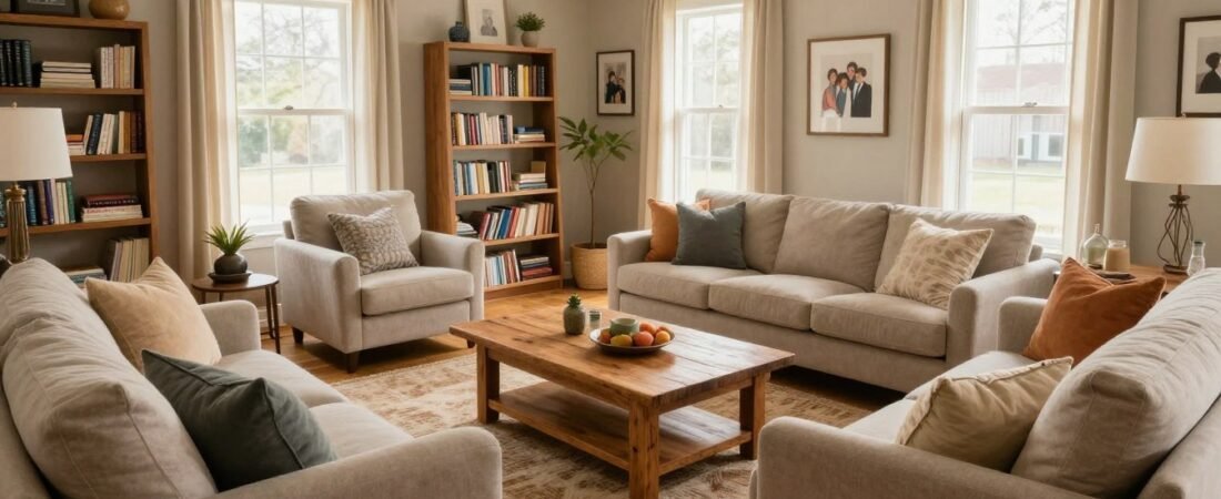
I look around my home and sometimes sense that a room should feel more welcoming than it does. That feeling does not always call for a makeover. Often, a few considered adjustments can make a space feel warmer and more intentional without adding square footage or starting a shopping spree.
I think comfort comes from how a room works as much as how it looks. The people who use it should be able to settle in, move around, and feel at ease. A practical change can be small enough to try in an afternoon, then adjust if it does not suit everyday life.
I begin with what already exists. Moving a piece, clearing a crowded surface, or changing where attention lands can shift the feel of a room without demanding more square footage. The goal is not to make every home look alike, but to make the space feel like it belongs to the people who live there.
The first useful adjustment is also one of the most practical: make the layout work for everyday conversation and movement.
Key Takeaways
- A conversation layout lets people see and speak to one another without twisting their bodies.
- Clear paths can make the room easier to use, even when floor space is limited.
- An area rug should connect the seating instead of looking like a small island.
- Choose colors, lighting, and decor that suit the room you have.
- Try one low-cost change before deciding what to buy.
The Small Changes That Finally Made My Living Room Feel Cozy (and Intentionally): How I Reworked the Layout
Guests should not have to turn their whole bodies to join a conversation. I use a conversation layout, a seating arrangement that lets people see and speak to one another without twisting their bodies, to make a living room feel easier to use.
Aim for 30-36 inches of clearance between large furniture pieces where possible. If the room cannot fit that, 18-24 inches is a workable compromise, not permission to block a doorway. A clear route matters more than squeezing in one extra seat.
Keep a clear route through the room, aiming for 30-36 inches between large pieces when possible. Treat 18-24 inches as a compromise, and never block a doorway.
Arrange seats so people can talk
A sofa facing two chairs creates an easy place for people to talk. Chairs angled toward a sofa can work just as well, especially when the room is long or one seat needs to face a window.
In a small space, I might place chairs on either side of the sofa instead of lining every seat along one wall. That arrangement can make room for conversation without requiring a large central seating area. I check that people can see each other from their usual seats.
Keep the route through the space clear
Before shifting furniture, I identify where people naturally walk: from the entry to the sofa, from the sofa to a doorway, or past the seating toward another part of the home. Those paths shape how much space the furniture can use.
- Identify the main route through the space.
- Keep seating within easy conversational view.
- Preserve the 30-36-inch clearance where possible, or 18-24 inches if necessary.
- Test the arrangement before moving every accessory.
I test a new arrangement by moving only the larger pieces first. I sit in each seat, walk through the room, and notice whether the furniture feels natural in everyday use. When the layout works, I can choose an area rug that visually anchors the seating.
Choose an Area Rug That Anchors the Seating
A sofa can look as though it is floating when its area rug is too small. I use the rug to connect the seating zone visually, so the sofa and chairs feel like parts of one room rather than separate pieces on the floor.
Let the rug extend at least 6 inches beyond each side of the sofa, with 8 inches as the ideal. Common living room sizes include 8-by-10 feet and 9-by-12 feet, but neither size suits every floor plan.
| Guideline | Measurement or direction | How to use it |
|---|---|---|
| Common rug size | 8-by-10 feet | Compare against the seating area and available floor space |
| Common rug size | 9-by-12 feet | Consider when a larger seating zone needs a wider anchor |
| Rug width beyond sofa | 6 inches minimum; 8 inches ideal per side | Check the rug reaches past both sofa sides |
I usually orient the rug along the length of the sofa. That direction makes the seating area feel more cohesive and gives the rug a clear relationship to the largest piece. The rug should not look like a narrow runner placed in front of the sofa.
These sizes are reference points, not a promise that a standard rug will fit every room. Doorways, built-ins, and the shape of the floor can change the right choice. I check the walking route before settling on rug dimensions, so the rug does not create a trip point or pinch a path.
If a standard size leaves too much bare floor or blocks a route, I compare its outline with the actual seating area before buying. A useful rug choice supports how the room works, not just how it looks in a product photo. With the room’s large anchor in place, I can edit the smaller objects around it.
Edit the Clutter and Give Favorite Pieces Breathing Room
A surface crowded with little objects can hide every individual favorite. I reduce visual clutter by choosing which pieces deserve attention, rather than treating every empty spot as an invitation to display something.
A few well-spaced objects in varied sizes often feel calmer than many small things packed together. That does not mean a room has to look bare. It means each chosen object should have enough room to register.
I start with a quick edit instead of trying to solve the whole room at once. These small actions help me see what is already there and decide what I want to keep visible:
- Remove items that do not serve the room.
- Clear one surface completely, then return only useful or favorite pieces.
- Store art that is leaning against a wall if it makes the area feel crowded.
- Leave favorite pieces enough space to stand out.
Leaning art can look relaxed when it is intentional, but several frames stacked in a tight corner may make the walls feel busier. If I like the pieces, I can keep them and change their spacing or choose one to display at a time. The point is to give the room a little visual breathing room.
Maximalist decor can still feel intentional. I look for a mix of scale and avoid arranging everything as if it needs to compete for attention at once. A large object beside a few smaller pieces can feel more composed than a dense row of tiny objects.
Once the surfaces have room to breathe, color can add warmth without filling the living room with more things.
Use a Warm, Cohesive Color Palette
A room feels calmer when its colors relate; competing contrasts can make the same room feel chopped into pieces. I build a cohesive palette from tones that work together instead of asking every object to match.
View paint beside existing upholstery and flooring before committing. White is not an automatic fix, and a darker hue can overwhelm a compact room if it feels too intense in that space.
| Approach | How it can read | Watch for |
|---|---|---|
| Related warm neutrals | Soft, connected, and easy to live with | Too many similar shades can look flat |
| Narrow range in one hue | Coordinated without making every item match | Strong shifts in tone can feel choppy |
| Deeper color on walls and trim | Enveloping and visually connected | Intensity may overwhelm a compact room |
Build warmth through related tones
Related tones can come from paint, upholstery, flooring, and the pieces already in the room. I might keep most of the palette quiet, then let one or two shades add depth. A cohesive color scheme does not require identical fabrics or a single exact shade throughout the home.
Instead, I look for colors that sit comfortably together when I see them side by side. A favorite chair can bring in a different tone without making the whole design feel mismatched. The room can have variation and still feel connected.
Choose wall color for the room you actually have
Before choosing a wall color, I consider the existing finishes and the overall feel I want. A darker color can create a rich effect, but the same paint may feel too strong in a compact room. White can feel fresh, but it does not solve every room’s color problem.
I test paint beside the upholstery and flooring in the room rather than judging it alone. That simple check helps me see whether the palette works as a whole. Once the broad color choices feel settled, a small, deliberate accent can give the composition definition.
Add a Few Dark Accents to Ground the Design
A mostly neutral living room can still feel unfinished when nothing gives the eye a place to land. I use a few small dark accents to add contrast and visual weight without letting black take over the room.
Spread dark details around the room instead of clustering them together. A little black in more than one area can connect the design, while a single heavy cluster may feel disconnected from the rest.
| Accent | Possible placement | Role in the room |
|---|---|---|
| Black detail in artwork | Wall above a sofa or console | Adds a small repeated point of contrast |
| Black lamp detail | Side table or floor lamp | Connects a useful object to the palette |
| Black vase or shelf object | Open shelf or cabinet | Gives a small area visual weight |
Black details can appear in artwork, lamps, vases, shelf decor, and furniture details. I choose just a few placements that already make sense, rather than adding a dark object to every surface. The aim is a subtle rhythm, not a room full of matching accents.
Someone who wants a very light look can use small accents instead of committing to a large dark feature. A thin frame or a lamp detail may be enough to give the room definition. If even that feels too bold, I keep the contrast minimal.
A dark detail works best when it supports the room rather than drawing attention away from everything else. Once the visual contrast feels balanced, softer tactile layers can make a seat more inviting.
Style a Throw and Layer Soft Textures
A sofa can have the right color and still look bare without tactile contrast. I bring in soft texture with a throw and a restrained mix of pillows, making the seat feel comfortable rather than staged.
Comfort matters more than a perfectly styled sofa. I choose pieces I want to touch and use, then arrange them in a way that looks considered without asking anyone to preserve a showroom pose.
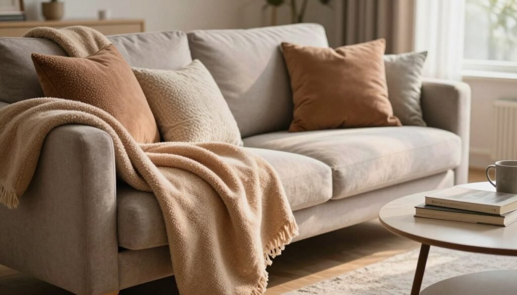
One option is an intentionally relaxed drape, slightly off-center along the sofa arm or back. That can look easy and welcoming, especially with a light, flexible throw. A thick throw may look bulky when casually draped, so I check how much fabric gathers in one place.
For a neater look, I fold the throw lengthwise and place it on the seat beneath the pillows. That keeps the fabric visible and easy to reach without covering the entire sofa. I adjust the fold so it does not feel like a stiff display that nobody should disturb.
Texture can come from contrast, not quantity. A soft throw beside smoother pillow fabric gives the eye and hand a change of feel. I would rather use a few cushions that suit the seat than pile on every pillow I own.
Every home uses its seating differently, so I test the arrangement by sitting down. If a pillow slides or the throw gets in the way, I change it. Once the sofa feels welcoming, a tray offers an easy way to make the coffee table feel organized.
Use a Tray to Make the Coffee Table Feel Intentional
Small useful items can spread into separate, untidy clusters across a coffee table. I use a tray to gather the things I reach for and make them read as one composed arrangement instead of several unrelated piles.
A tray works best when it groups a few useful items, not every object without a home. I might set out books, coasters, a snack bowl, and remote controls, then leave the rest of the table open for daily use.
I also consider shape. On a rectangular coffee table, a round tray can soften the hard lines; on a round table, a square tray can add contrast. The different shapes help the tray feel like a deliberate part of the arrangement.
Useful tray contents can include:
- Coasters
- A small book stack
- A snack bowl
- Television remotes
I keep the grouping small enough that people can still set down a cup or move the tray. A tray can also corral a few bar items on a cabinet, but it should not become a landing place for unrelated clutter. Its job is to contain a useful group.
If the items change during the week, I simply return the ones I use to the tray and put the others away. That keeps the coffee table practical without making it feel precious. From the tabletop, I turn to the room’s overall light, especially what changes after sunset.
Layer Lamps for a Softer, More Even Glow
A single overhead light can make a room look flat, while several softly lit areas create a warmer feel. I layer different light sources so the living room is useful in the evening without relying on one harsh beam.
A useful mix can include a floor lamp and at least one table lamp, depending on room size. Warm bulbs commonly fall in the 2700K-3000K range, and keeping the light color consistent helps the room feel connected.
| Light source | Useful placement | What it adds |
|---|---|---|
| Floor lamp | Dim corner | Light beyond the room’s center |
| Table lamp | Side table or console | A softer pool of light at another height |
| Overhead fixture | Ceiling | General illumination across the room |
Combine lamps at different heights
Lamps at different heights distribute light across more of the room and create visual movement. A floor lamp can brighten a corner, while a table lamp makes a lower, warmer pool near a seat. Their light feels less uniform than one fixture overhead.
Room size helps decide how many lamps are useful. A small room may not need a lamp at every seat, especially if one well-placed floor lamp and a side-table lamp cover the dim areas. I place lights where people need them, not simply to fill every corner.
Put light where shadows gather
I notice where shadows collect after sunset, such as beside a tall bookcase or behind a sofa. A lamp near that spot can even out the room without adding glare. Warm bulbs around 2700K-3000K keep the light color from shifting sharply between fixtures.
If the layered lamps provide enough illumination, I can turn off the overhead light at night. The ceiling fixture still has a job for general light, but it need not set the mood every evening. Once the light is balanced, I consider which furniture pieces are worth keeping in the room.
Edit Furniture to Free Up Floor Space
An extra furniture piece in a corner can make it difficult to move through the room. I look at each item’s function, scale, and visual weight before deciding whether it deserves its floor space.
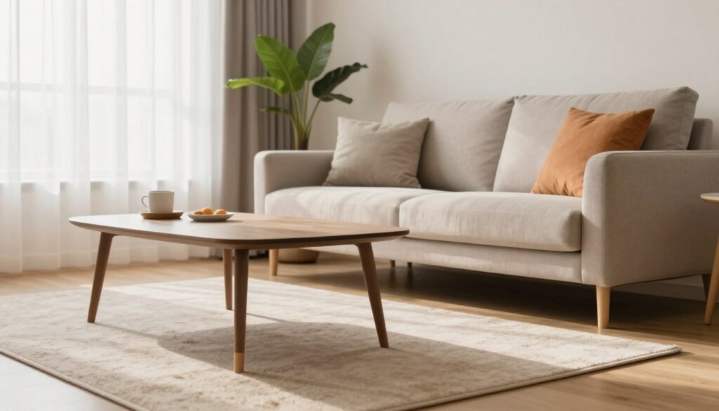
A small room does not automatically need miniature furniture, but too many bulky pieces can restrict movement. Open legs can reveal more floor, and storage furniture makes sense when I have a real need for what it holds.
Keep pieces that fit the way you live
I ask whether each piece earns its footprint. A chair that gets used may be worth keeping, while a second table with no clear purpose could be taking up a useful path. A larger item can work in a small room if it serves the way people live there.
I check the room in motion, not only from the doorway. Can someone pass without turning sideways? Does a table make it awkward to reach a seat? Those practical checks tell me more than the label “small space” does.
Choose useful storage that stays visually calm
Storage furniture should solve an actual storage problem. A closed cabinet can keep everyday supplies out of sight, but removing storage is not helpful if essentials then have no home. I match the furniture to what needs to be stored and how often I use it.
Before keeping or removing a piece, I use this quick checklist:
- Measure the piece against the available path.
- Remove one redundant item.
- Favor a lighter-looking base where practical.
- Move rarely used supplies into closed storage.
I try one change at a time and notice how it affects daily use. A room can feel more open without making it less functional. Once the furniture footprints make sense, I look to the windows and vertical lines that can make the room feel taller.
Hang Curtains High to Stretch the Walls
A window can look shorter than it is when its curtain rod sits directly on the trim. I hang curtains higher to draw the eye up and make the window feel larger without adding another piece of furniture.
Mount curtain rods close to the ceiling or just below crown molding, and let panels reach the floor. Panels should finish no more than 1 inch above the floor or lightly touch it.
Full-height curtains can visually elongate a wall because the fabric creates one long vertical line. The window may feel taller, and the panels can soften a plain wall without asking for extra decor. That effect depends on keeping the fabric at a useful height and length.
Before settling on a rod position, I check the room’s paths. A panel should not block a frequently used walkway or cover more of the window than the room can spare. If the window needs every bit of its opening, I make sure the panels can sit clear of the glass.
Renters should check what installation changes their lease allows before drilling. A high rod may need more than existing hardware, so I plan around what the home permits. The aim is a longer visual line, not damage or a panel that gets in the way.
When the curtain placement works, it can make the whole wall feel more finished. Then I can decide which artwork and objects deserve the clearest attention in the room.
Give the Room One Clear Focal Point
A wall covered in little competing decorations can make it hard to notice any one piece. I give the room a focal point, a clear visual anchor that helps the eye settle instead of jumping from object to object.
One strong focal point usually gives a compact room more direction than several unrelated small pieces. It could be impactful art above a sofa, a fireplace styled with restraint, or a particularly distinctive rug.
A collection can work when it has a deliberate scale and arrangement. I might group related pieces so they read as one considered display, rather than scattering small art across a wall without a clear relationship. Several unrelated objects can fragment a compact space.
Not every wall needs art. A clear stretch of wall can help the room feel less crowded and give the chosen piece more presence. I would rather display something meaningful than buy an object simply to fill a gap.
The focal point does not have to be the most expensive object in the room. Its job is to give the eye a place to land and help other details feel connected. Once I know what deserves attention, I can add personal and natural details that make the room feel lived in.
Add Personal and Natural Details
A room can look polished yet feel anonymous when nothing reflects the people who live there. I add a few personal details so the home feels lived in, not like a display copied from a catalog.
Choose details that mean something or suit the room’s care needs, rather than filling every shelf. One natural element and a few meaningful objects can say more than a crowded display.
Bring in one natural element
A plant can add a natural shape and a little life where the available light and care routine suit it. I consider whether the spot gets enough light and whether I can keep up with watering before bringing one home.
Plants are optional. A room should not acquire a high-maintenance item just to follow a decorating trend. If a plant does not suit the space or the people who live there, I can choose another natural detail or leave the spot open.
Display pieces that mean something to you
Framed art, books, and keepsakes can make a living room feel personal when I choose them for a reason. A book I return to or an object tied to a memory can feel at home beside more practical pieces.
I do not need to display everything I own. Leaving some items stored gives the pieces I choose more meaning and keeps the room from feeling like a shelf of obligations. Personal details should feel like part of life, not a task to maintain.
When I know which objects belong in the room, I can consider where natural light falls and whether reflective surfaces might extend it.
Use Mirrors to Extend Light and Sightlines
A dim corner may feel brighter if a mirror can reflect light from a nearby window. I test the mirror’s position before hanging it, because placement matters more than scattering several small reflective objects around the room.
A mirror can reflect existing natural light, but it cannot create natural light where a room has none. I try one across from a window or use a tall mirror to reinforce the room’s vertical lines.
A mirror across from a window may send daylight deeper into the room, depending on the angle and what sits between them. A tall mirror can also draw the eye upward and extend a sightline. I look at the effect from the places where people actually sit.
Before I hang a mirror, I check what it will reflect. If it doubles a cluttered corner or an awkward view, it may make that distraction more noticeable. Shifting the mirror to a cleaner angle can help the room feel brighter without adding a cluster of smaller mirrors.
One thoughtfully placed mirror is often easier to live with than several reflective objects competing for attention. If the room has little natural light, a mirror can still extend the view, but it cannot replace a light source. From reflection, I move to a final visual check: the mix of scale and open space.
Balance Scale and Leave Space for the Eye
A shelf crowded with tiny objects of the same size can feel less considered than one with varied pieces and visible gaps. I balance scale so the room feels intentional rather than bare or visually busy.
A large object can anchor smaller accessories, while a clear stretch of wall or tabletop gives the eye a rest. A maximalist room can still work when its objects vary in scale and have a deliberate arrangement.
For a quieter style, I leave breathing room around favorite pieces instead of filling each open spot. A large vase, framed work, or lamp can give smaller objects a scale to relate to. The size contrast makes the grouping feel chosen rather than collected at random.
For a fuller look, I can display more, but I still vary height and size. Several tiny trinkets lined up together may blur into one busy patch, even if they coordinate. A larger piece nearby helps the eye understand the arrangement.
I also leave some surfaces and wall areas clear. An empty stretch is not a decorating failure; it gives attention somewhere to pause. If a table or shelf feels crowded, I can move one item and see whether the remaining pieces make more sense.
When I want to change the room, I choose based on the frustration I notice most. That makes it easier to decide which adjustment to try first instead of buying several things at once.
Pick the First Change That Solves Your Biggest Frustration
I might pause before buying anything because several parts of the room feel unfinished at once. I choose the first change by naming the problem that affects daily use most, then trying a small adjustment before spending money.
Start with the room’s biggest frustration, not the most tempting product. An awkward path, a floating seating area, or an evening that feels too harsh each points to a different first step.
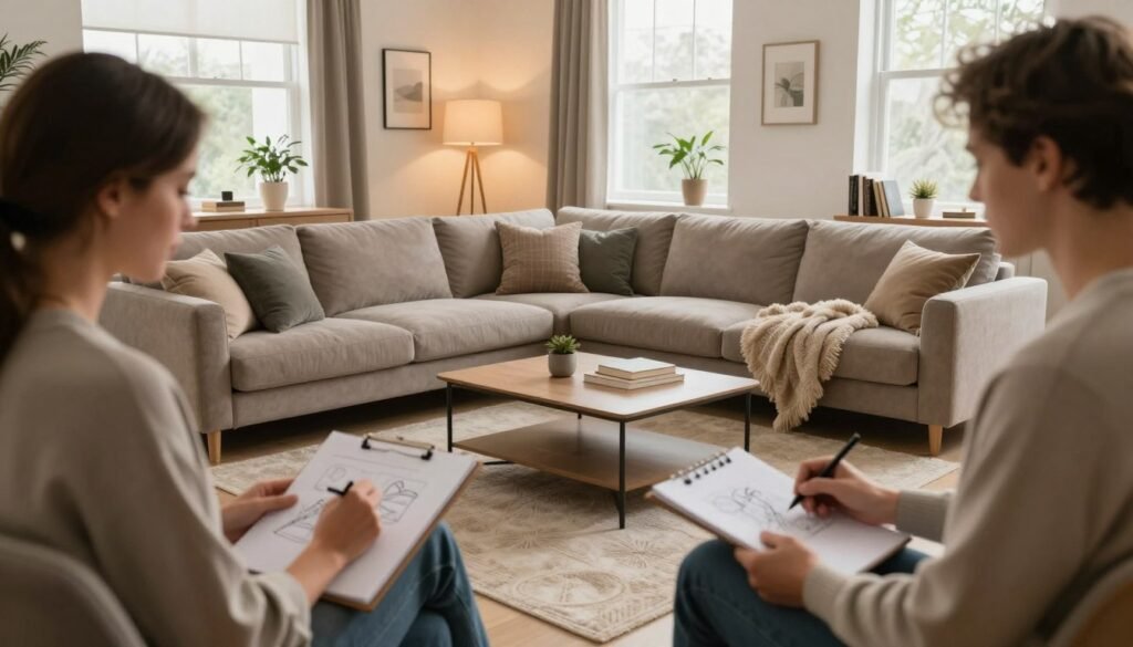
Try one no-cost rearrangement before buying anything. Let the room show you whether the change solves a real frustration.
I use this quick diagnosis to narrow the choice:
- Awkward movement means test the layout.
- A floating seating area means check the rug.
- A flat or harsh evening look means adjust lamps.
- Visual busyness means edit one surface.
The “15% rule” in decorating is not one universally standardized formula. Before applying it, I check what a particular design source means by that phrase, since the intended proportion can depend on its context.
The “three F’s” of interior design also do not have one universally established wording. As a practical personal checklist, I use function, flow, and feeling, but I do not treat those words as a formal definition.
My first test can be free: move a chair, shift a small table, or clear one surface, then live with the result. I focus on one low-effort adjustment and give it time to show whether the room works better.
Conclusion
A living room does not need to be perfect to feel good to live in. I get more from prioritizing comfort and function than from collecting decor, and I let the room’s scale guide each choice.
This week, choose one surface or furniture arrangement to adjust, then live with the result before adding anything else. A small change can reveal what the room actually needs. Make one easy adjustment, and notice how the space feels when you settle in.